Full metal dance off: Sarofsky continues James Gunn titles run with The Suicide Squad’s Peacemaker
James Gunn’s The Suicide Squad spinoff Peacemaker debuted on HBO Max in January, with the writer/director continuing a successful relationship with Sarofsky. The Chicago-based production company once again delivered a music-driven title sequence, as it did so well on both Gunn’s Guardians of the Galaxy outings.
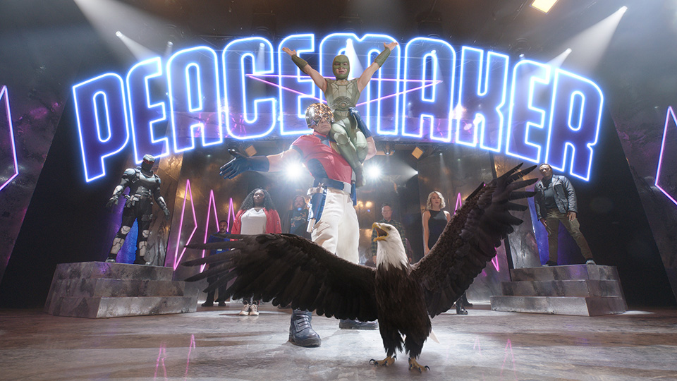
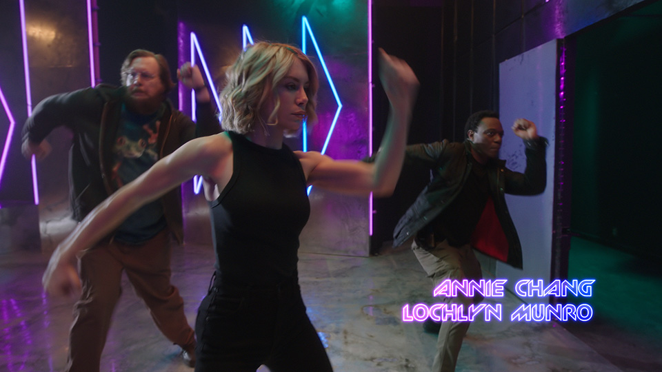
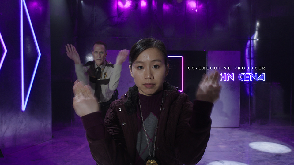
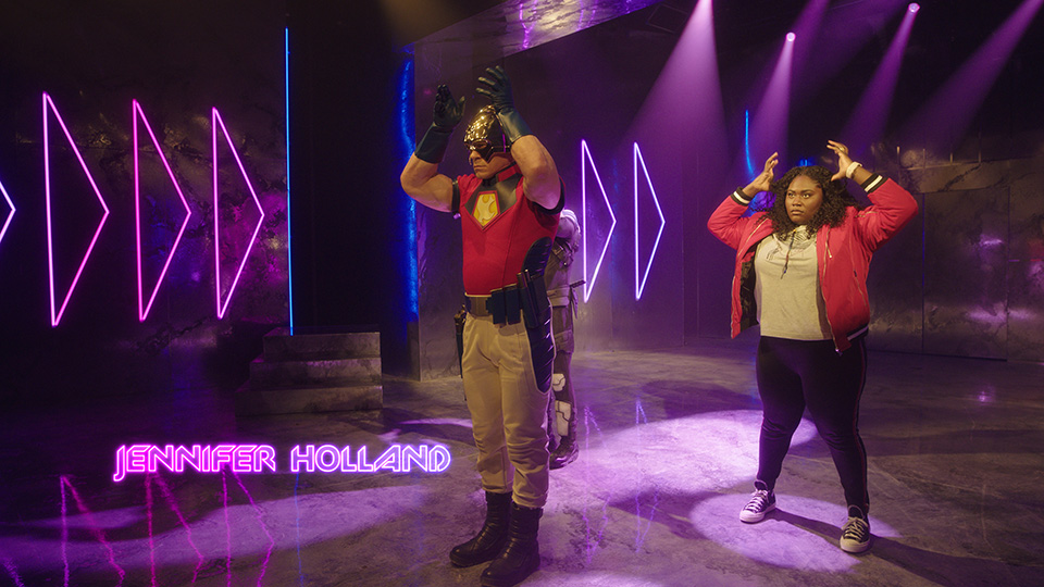
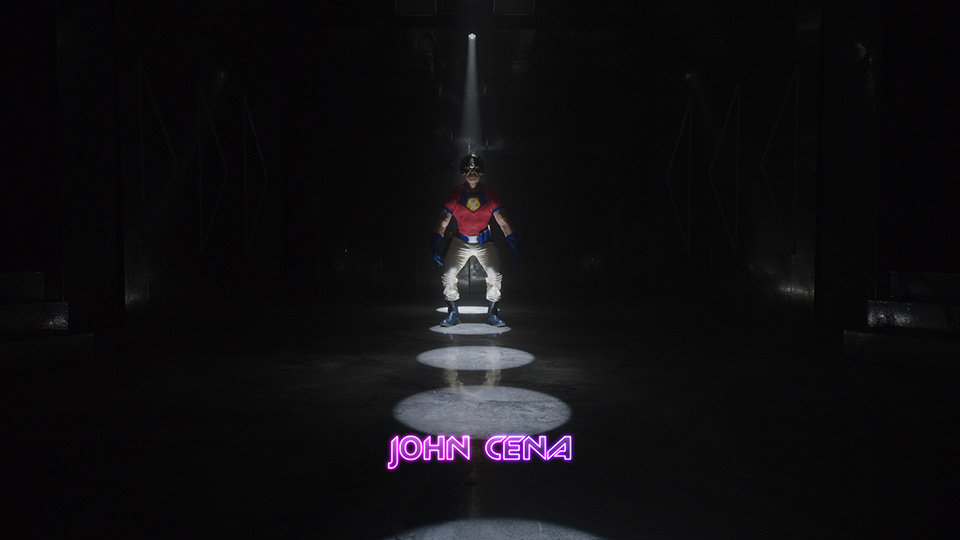
To introduce the show starring John Cena as the Peacemaker character, Gunn conceived and filmed a choreographed dance routine with the entire cast, set to the track Do You Wanna Taste It by Norwegian band Wig Wam.
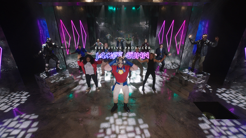
In full Peacemaker costume, Cena leads an incongruous dance number with his co-stars, while the titles are given a typographic treatment distinctly reminiscent of 80s hair metal bands.
For Peacemaker‘s main titles, the Sarofsky team handled typesetting, visual effects, and final compositing, with the font inspired by a deep dive into glam metal logos and concert posters.
“A lot of typography from that genre, while stunning visually, is nearly illegible,” said creative lead Duarte Elvas “As title designers, legibility is essential. When we discovered New Zelek, we were able to typeset it to do the job perfectly! It has the angular, geometric feel we were looking for, and the letterforms are clear and familiar enough that one can read the words effortlessly.”
Executive creative director Erin Sarofsky added: “Duarte was an all-star on this. He got to be very hands-on, and it shows with the precision and type mastery.” Studio credits for Peacemaker also include producer Dylan Ptak and designer Chris Rodriguez.
“We created a really cool treatment with a glowing outline,” Sarofsky explained. “That look was painstakingly explored to match the set design and genre, and heighten legibility. It all looks so intentional and just as it should be, and that’s because of the hours put into making it just so.”
To complement the bold statements made by New Zelek in neon, Josefin Sans is used in white for all secondary typography. Also worth noting, discriminating viewers will notice several moments in the dance sequence where the designers introduced subtle interactions between dancers and type.
As well as designing and setting type with Adobe Illustrator, Sarofsky’s main tool for look development, layouts, and animation is After Effects.
As with Gunn’s other superhero action features, Sarofsky created custom title cards. For “Peacemaker,” this includes “previously on” and episode title cards to be used throughout the season.
“For this project, we developed some alternate approaches that we loved, that did not make the final,” said managing director/executive producer Steven Anderson. “It’s yet another time where we are left wishing they could have used everything.”
Watch Sarofsky’s case study for Peacemaker
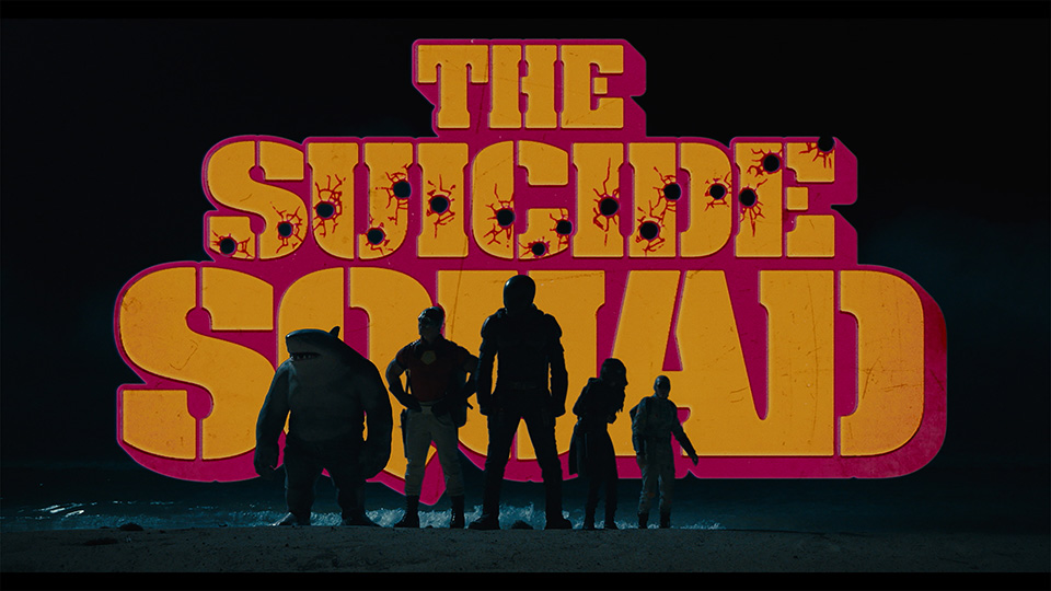
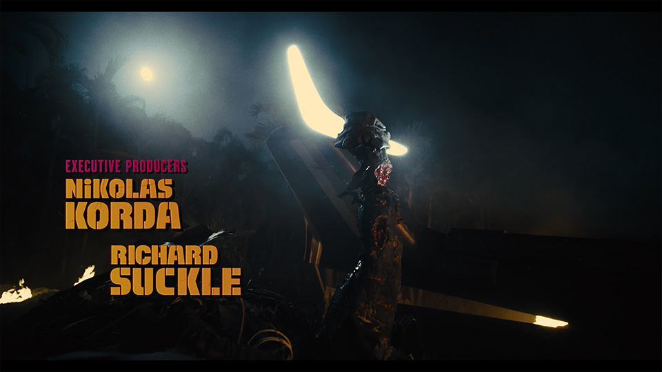
According to Sarofsky, James Gunn embraces design in his films as another character – which is why typography has been an essential ingredient in their collaborations. The work on Peacemaker follows the studio’s work on Gunn’s The Suicide Squad, an assignment that reportedly presented “atypical challenges for the Chicago studio’s expertise in typography, motion design, blockbuster VFX, and storytelling on a colossal scale”.
The film opens with Sarofsky’s stylized logo treatments, the appearance of the distinctive Osprey aircraft, prison walls, and a yellow-and-fuchsia-tinted logo.
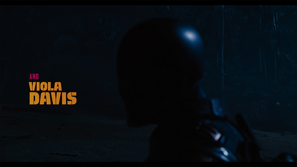
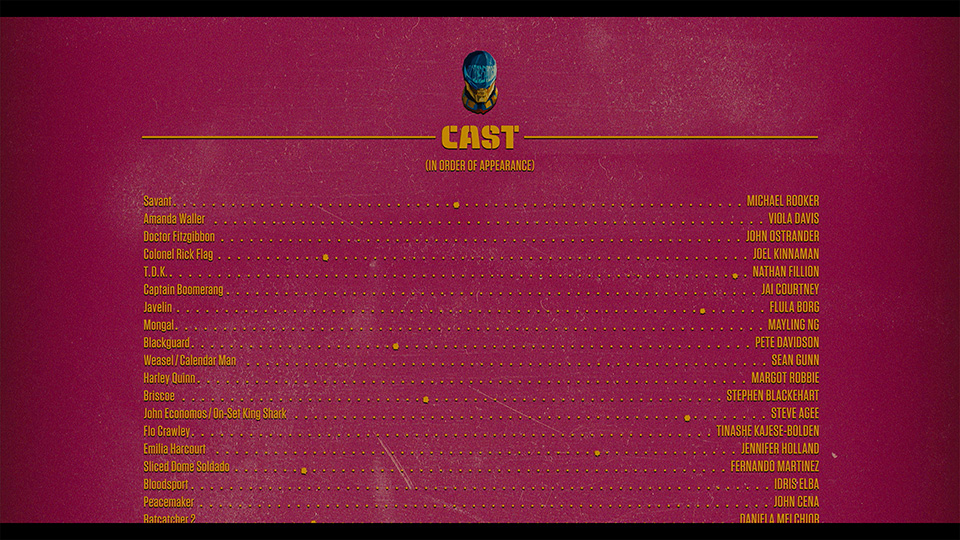
Further along, the main title sequence commences mid-military-operation as Task Force X (a collection of degenerate DC delinquents, classed-up by Bloodsport, Peacemaker, Harley Quinn, Colonel Rick Flag, Ratcatcher 2, King Shark, and Polka-Dot Man) is invading the enemy-infused island of Corto Maltese.
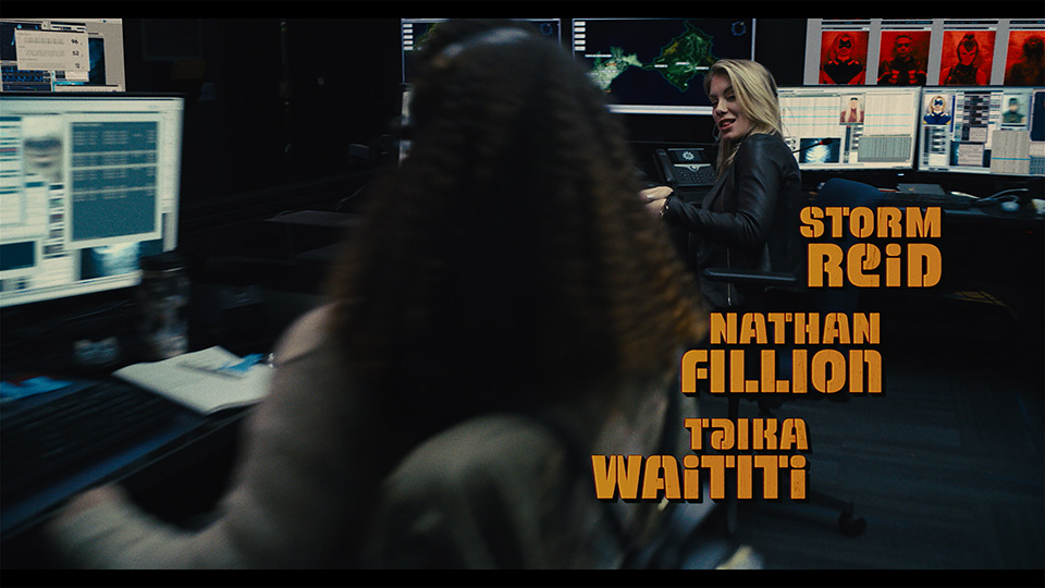
Reflecting The Suicide Squad title card’s bold stencil typeface and its highlighted colour scheme, title credits begin appearing during phase two of the stealth beach arrival. As the group assembles, the title treatment arises as backdrop, until the oddly upbeat track People Who Died by The Jim Carroll Band kicks in, triggering a faster-paced edit as the opening credits play out.
At the start of the process for The Suicide Squad, Erin Sarofsky and Duarte Elvas met with Gunn and film editor Fred Raskin ACE at a screening of a cut of the film: “Our discussion focused on creating titles that were bold, colorful, and worked with the dynamic underlying footage,” recalls Sarofsky. “We talked about a modern/vintage vibe… something that is very current but also has a nostalgic sensibility.”
“James was clearly looking for treatments that were evocative of 1960s caper war films,” added Elvas. “So we looked at titling made for films like The Dirty Dozen, The Great Escape, and The Guns of Navarone, and this really informed our exploration.”
The initial briefing also identified a few other design opportunities, such as for the end crawl, subtitles, and to stylistically integrate the WB and DC introductory logos.
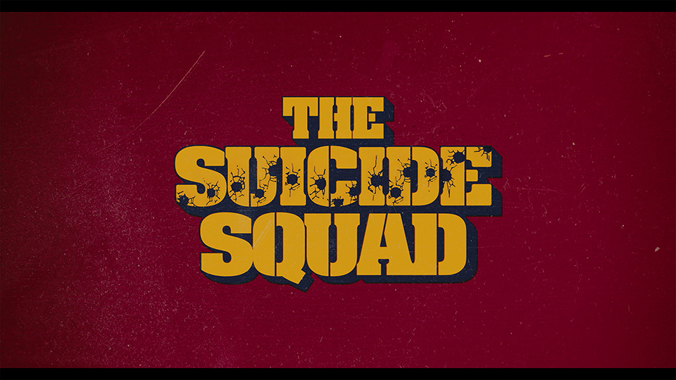
To match the existing logo for The Suicide Squad while also embracing the period war movie vibe, Team Sarofsky dove deep into 1960s films, printed ads, album covers, vintage fonts, and everything else they could find.
“For this job, the best tool we had was our years of typography expertise and our ability to problem solve legibility on a busy background in an intentional way,” Sarofsky explained. “After a few rounds of exploration with the filmmakers, we landed on Alpha Midnight, a 1969 typeface designed by Hiroshi Yamashita, for inspiration. We ultimately modified it so heavily, it could be its own unique font.
“Addressing the challenge of creating many different elements for the film, it was really important to us to make sure that all the executions related to each other, while also working well for where they were in the film,” she added.
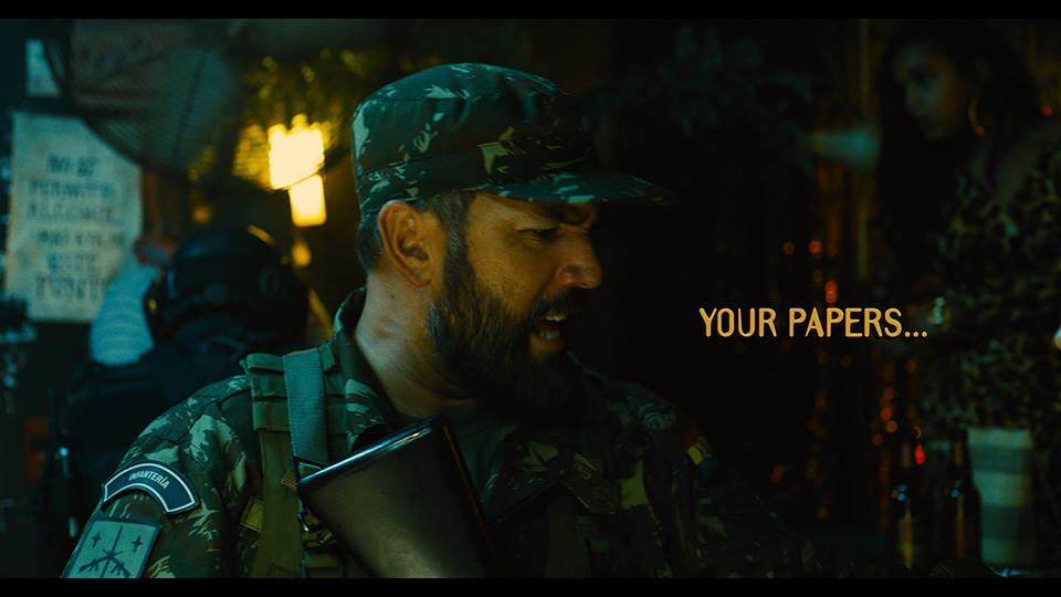
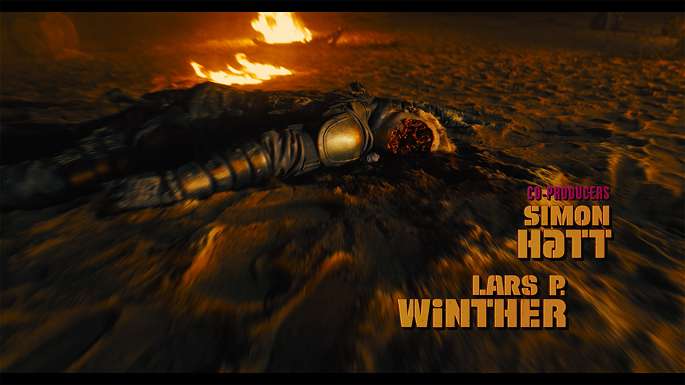
With type set in the custom version of Alpha Midnight for each moment of the main title, for each scene requiring a subtitle, and for the end crawl, Sarofsky’s designers then added more patent artistry to tie into 1960s-era war pictures, visually.
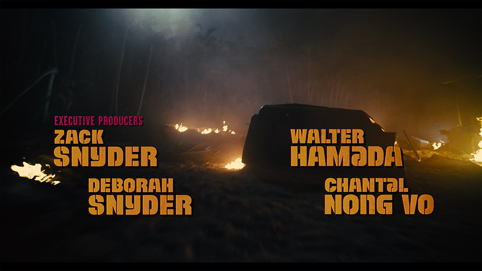
“The steps we took to make the titles appear as though optically printed on actual film were key to making this look like a 1960s film,” said Elvas. “To get them looking just right, each graphic took at least a dozen Adobe After Effects layers, including textures, grain, glows, bevels, and drop shadows. There is also a very subtle gate weave to all the graphics that further emulates the film effect.”
Illustrator was used for type design and setting, with After Effects deployed on look development, layouts, and animation. Sarofsky’s approved end-crawl designs were provided to Scarlet Letters, which set the typography and animated the scroll.
“Our ability to fit right into the VFX pipeline for major motion picture post-production is an immense source of pride for us here at Sarofsky,” said executive producer Steven Anderson. “Our well-established workflow allows us to contribute rendered sequences in all the right specs, and thanks to our experienced team, our work not only looks amazing, it integrates seamlessly. That is quite a feat for a such a phenomenal film from one of the world’s foremost filmmakers.”
Sarofsky’s team for The Suicide Squad project also included producer Dylan Ptak, VFX and finishing supervisor Cory Davis, and animator/designers Josh Smiertka, Cat McCarthy, Andrei D. Popa, Andrea Braga, Tanner Wickware, Jake Allen, and Matt Miltonberger. Final colour was courtesy of Company 3.
Log into Vimeo for a montage of Sarofsky’s design contributions to The Suicide Squad