Attik gets zappy with Experticity branding
Attik has been busy developing the new corporate logo and a complete visual identity system (VIS) for US retail strategy firm Experticity.
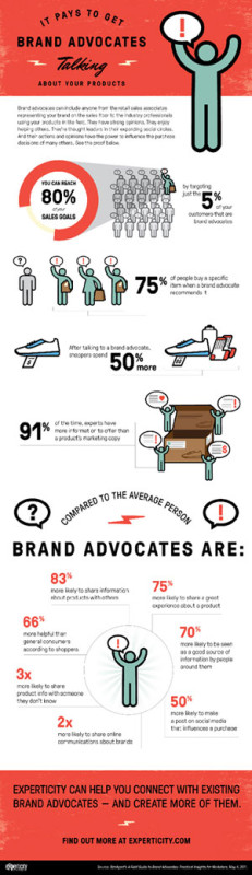
Experticity infographic
reflecting ATTIK’s branding
guidelines.
The company builds and rewards expertise in influencers that customers turn to for advice on what to buy. So far the new Experticity branding has been executed in a new website, email campaigns, print collateral and in video work.
“We’ve evolved quite a bit as a company, and we needed a sophisticated identity with a human touch to represent the level of helpful expertise our brand represents,” said Experticity CEO Tom Stockham. “We knew Attik had a long history of exceptional brand work for top-tier clients, and we were delighted at how quickly they were able to comprehend our business.”.
Attik associate creative director Stu Melvin led the project, working with many members of Attik’s design and planning departments. The team began by creating a platform to help Experticity effectively communicate with a wide range of audiences, including 1.5 million helpful experts, executives at hundreds of retail and product brands and the managers of 60,000 retail locations.
According to Melvin, the new VIS had two major goals: projecting a memorable, human-centric brand identity reflecting the electric experience of interacting with a passionate expert; and accommodating the brand’s need to be effective across all industries.
Custom letterforms were devised to create a classic typographic look. According to Attik, having a lightning bolt make a connection between the first and second T of ‘experticity’ creates a fluid movement from left to right and enhances legibility.
“The concept of the lightning bolt was retained from the previous identity,” Melvin explained. “The bolt is a powerful brand icon that we applied throughout the larger system. From there, we incorporated a ‘human touch’ approach to key elements of the completed VIS by using texture on a warm colour palette, handcrafted typography, playful illustrated iconography, and an optimistic style in our photographic elements.”
“We set out to create a VIS that employs the same skill and craftsmanship that we see in our members and clients. I feel on every front – strategy, copy and design – we were successful in creating that with Attik,” said Experticity creative director John Meese.
“Having a rock-solid VIS in hand is critical to my team’s success building a world-class brand worth working with and working for, and the creative has been a joy to work with.”

Left: Earlier Experticity logo. Right: New Experticity logo.
2D version of the new Experticity logo