Illustrated Portraits for Digital Arts
What is the secret of convincing portraiture, whether done digitally or in traditional media or a mixture of the two? And how important is it that depictions be faithful to the subject, or is there a great deal of latitude in terms of personal interpretation? I talked to a group of leading illustrators to find out, in a feature for Digital Arts Magazine.

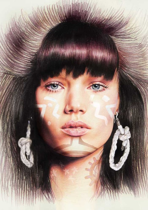
Minni Havas created this image for designer Anne Törnroos, who used the picture for an earring box. "The picture is based on a photo and it’s mainly drawn with watercolor pencils, the earrings are merged with photo and the signs on her face are taken from another picture," explains the artist
Here’s an extract:
For fleshing out a portrait, Finnish artist Minni Havas recommends starting from your faintest colours and carefully adding them from lighter to darker on top of each other.
“That way you can still make corrections to the image while drawing,” she explains. “When I draw or paint skin, I keep in mind that human skin is translucent and covers blue and reddish blood vessels. So the skin isn’t monotone.”
“I never use black for shadows on skin or textile,” she adds. “Instead I use complementary colours mixed with darker shades of the base hue.”
Cardiff-based illustrator Kath Morgan uses a technique of working upwards through the levels of detail for both digital painting and acrylic. “What this means is that I’ll start out by blocking in the main areas of light, dark and colour, making sure that all the structures are as I want them,” she explains. “Then I’ll refine these with smaller brushes during the longest part of the painting process.
“The details go in last. Getting caught up in detail too early can result in a distorted image you can’t bear to erase, or boredom when you realise how much work is left to go.”


