Retooned Network
Cartoon Network will be sporting a new look and tone from now on thanks to a collaboration with Brand New School

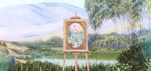
The checkerboard-inspired grid permeates every part of the network, including transitions like the one in this morning bump. Image courtesy of Brand New School and Cartoon Network.
The network chose to embrace its brand visual heritage of the black and white checkerboard by imbuing it with new meaning, and the artists and producers of Brand New School (BNS )were able to bring this idea to life in a fresh, compelling way using dimension, colour and movement. All the new design elements began appearing in late May, and the new on-air IDs premiered on the network last week.

Every CN day starts and ends with the dashboard clock, as pictured here waking up after a long night of adult swim programming. Image courtesy of Brand New School and Cartoon Network.
“Our brand expansion represents our commitment to delivering a breadth of content that our audience cannot find anywhere else,” said Senior Vice President of Creative Direction, Michael Ouweleen. “The checkerboard is in our DNA and is not only reflected in the subtle redesign of the logo but also provides a through line that connects and helps frame our diverse slate of programming from animation to live-action. The art direction and creative acumen of the Brand New School and their ability to breathe new into the iconic was invaluable and helped us achieve our goal.”

A morning bump highlighting CN's new patterns and DNA, its graphic icon system. Image courtesy of Brand New School and Cartoon Network.

For show menus, the checkerboard explodes in space, becoming endless portals for Cartoon Network's characters to spring from. Image courtesy of Brand New School and Cartoon Network.
BNS founder and creative director Jonathan Notaro, along with art directors Eric Adolfsen and Mike Calvert, provided detailed insights into the conceptual thinking behind the multifaceted brand expansion project, where their approaches emphasized interconnectedness across each and every deliverable, as well as the pairing of extremely thoughtful design with animation geared toward generating specific audience responses, including laughter.
“This has been a very exciting opportunity for us to be closely involved with Cartoon Network and their continued evolution,” Notaro began. “The new on-air identity complements its diverse range of visual languages, and leverages our design expertise by incorporating specific, creative means for consistently packaging the network’s editorial humor into every second of each broadcast day.”

"An ad for CN's website that is itself a play on advertising." Image courtesy of Brand New School and Cartoon Network.

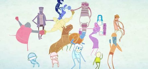
Eric Adolfsen:"The illustrated logo concept gave us the chance to curate the many artists we most wanted to share with Cartoon Network's viewers". Image courtesy of Brand New School and Cartoon Network.
By combining their design ideas within the organizational approach, the BNS team was pleased to have created a meta-narrative that uses the complete visual identity system to creatively convey the interconnectedness of the channel’s content. From the promos to the menus to the bumps to the IDs, each piece tells the same story from a different perspective, where the checkerboard functions like a chessboard, with infinite moves possible.

Afternoons kick off with the power-up of CN's dashboard, a visualization of the odd inner-machinery of the station. These widgets are individually spotlighted throughout the afternoon. Image courtesy of Brand New School and Cartoon Network.